Property Management
Property Raptor 2.0
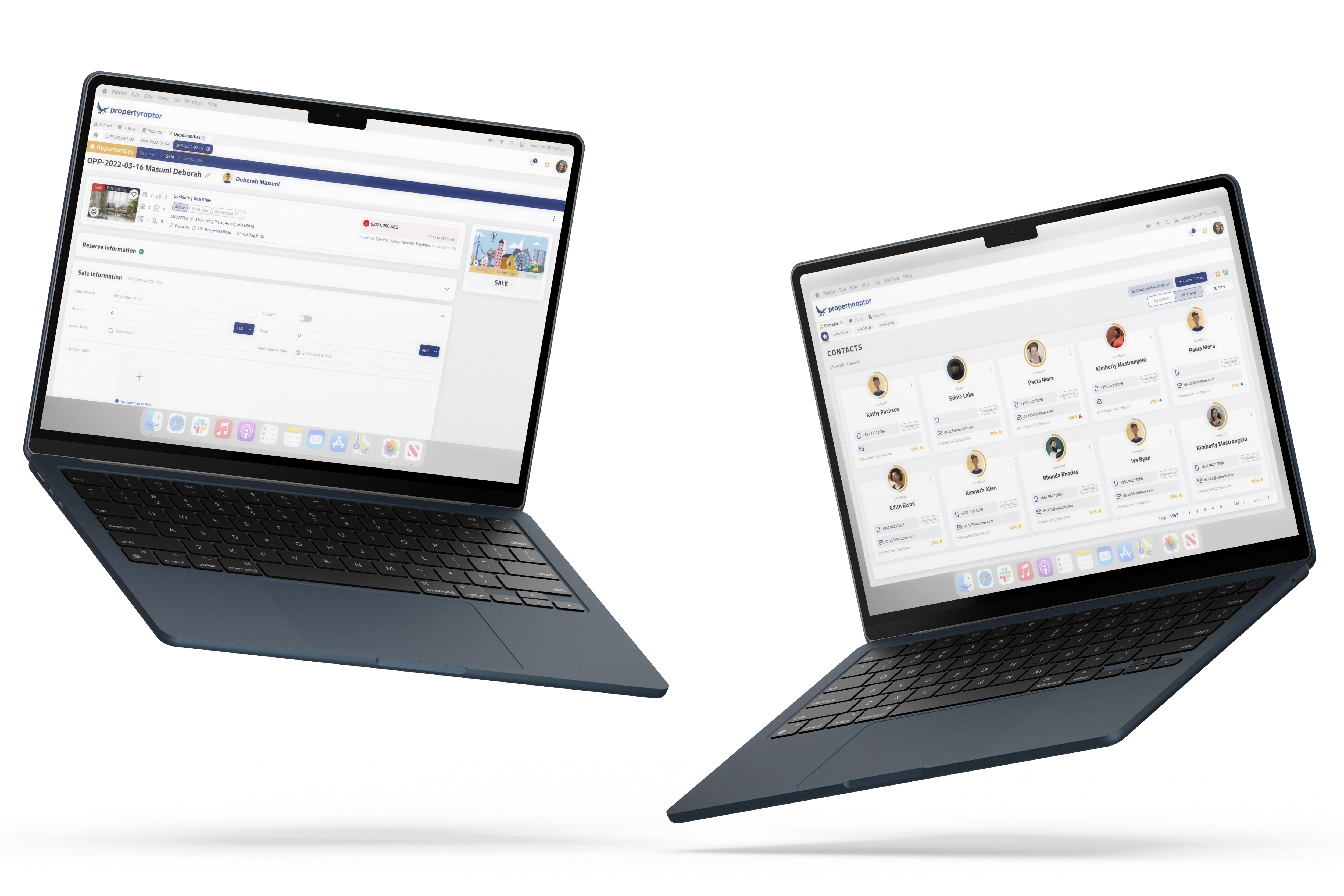
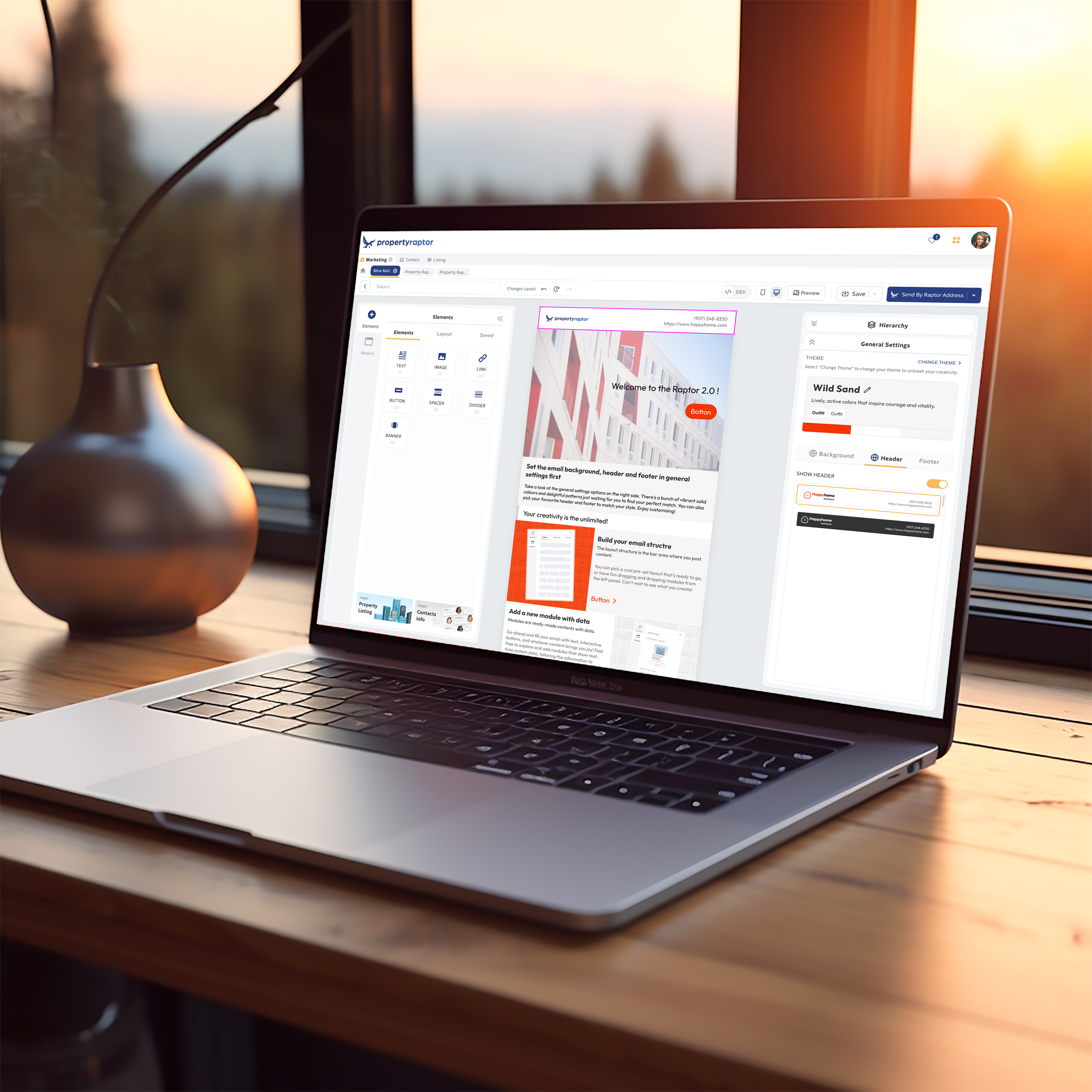
An all-in-one system for client relationship management, property listing organization, appointment scheduling, document storage and creation, marketing tools, an analytics dashboard, and mobile compatibility.
You may want to know
Project Overview
Deliveries
Product Design, Illustrations
Timeline
Dec 2022 ~ Now
Year
2022
Industries
Web Application, Apps
What did I do?
Responsibilities
Research, UX & UI, Illustrations
Tools
Figma, Adobe Illustrator, Notion, Draw.io
Background & Introductions
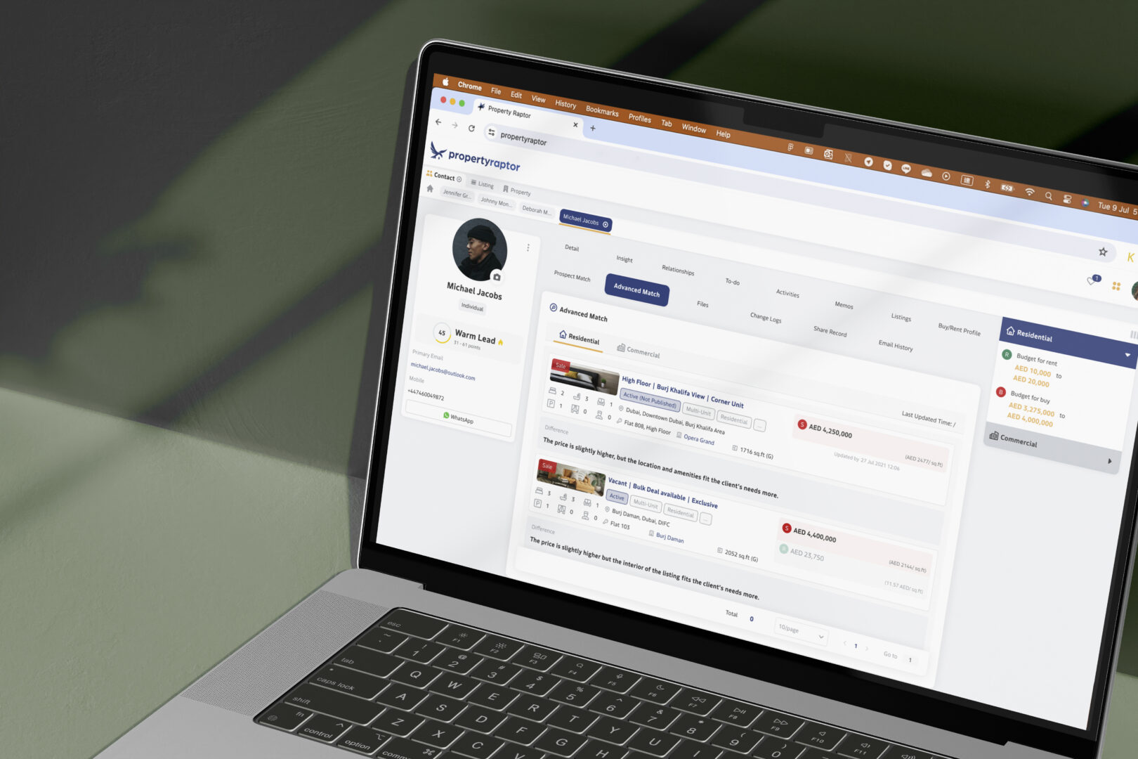
Property Raptor is an all-in-one B2B system of real easter for the property agencies to sell & rent real estates and manage customer relationships, property listing organization, appointment coordination, document storage and creation, marketing resources, Salesforce‘s analytics dashboard, and mobile compatibility.
B2B products focus on enabling users to complete tasks, while C2C products focus on user experience.
Why?
Product revamp is undoubtedly huge in terms of workload and consumption of company resources. Before revamp a product, we need to determine the purpose of revamp.
Reasons for product revamp:
1
The interaction is outdated/unintuitive, and need to training is required to use it;
2
The functions relationship is confusing and the workflow is unclear;
3
The structure does not support new requirements and it has less scalability.
The Challenges Of Time Management
By late 2022, the rebrand became Raptor’s top priority. The company planned to revamp the system interface and user experience to better meet client needs. While the product was identified as crucial, the strategy focused on revamping the product UI. The existing system is designed by the product owner and development team was developed under tight deadlines, which may have compromised user-friendliness. They did not invest enough time in understanding user needs and behaviors through analytical and innovative thinking.
The team was small, consisting of just me for interface design, collaborating with the product manager and front-end developer. We had a tight timeline for phase 1, with only 2 months for design, 4 months for development, and 1-2 months for QA.
We could only breathe a sigh of relief once we completed phase 1.


A roadmap of product design
The Challenges Of Product Design
I need to find out what issues in the existing system are affecting the user experience. I also need to define which features, parts, elements we need to keep in the modified version and why we need to do this.
Here are my insights and observations below:
1
The existing design was looks old and out of step with the needs and expectations of its users. It looked behind the times.
2
Many real estates client’s agents reported that the existing system was difficult to use, and I believe some of its intuitiveness was lost due to confusion and unusual function naming.
3
The system did not make a comprehensive plan at the beginning, which led to the development of more and more functions.
What does it mean?
User Challenges
The old UI design and odd naming conventions made the system unnecessarily complicated.
Business Impact
The outdated appearance could drive potential clients to competitors with more modern designs.
Complex Architecture
The system design is becoming more intricate, leading to slower loading speeds.
Goal – How to solve it?
First, we don’t have as many resources as the largest tech companies, and we work on a tight timeline. So we needed to define what design strategy would work for our small team.
Our Strategy
1
Focus on Improving UI
Rethink the business model to redesign the solve methods.
Draw a Services blueprint to examine and observe the user’s daily workflow. This design can also be compatible with the existed system’s structure.
2
Analysis Client’s Feedback
We’re difficult for us to contact real users in b2b business model, so we compromise on collect feedbacks during daily contact with the client’s Project Manager to make improvements.
3
Modular Design
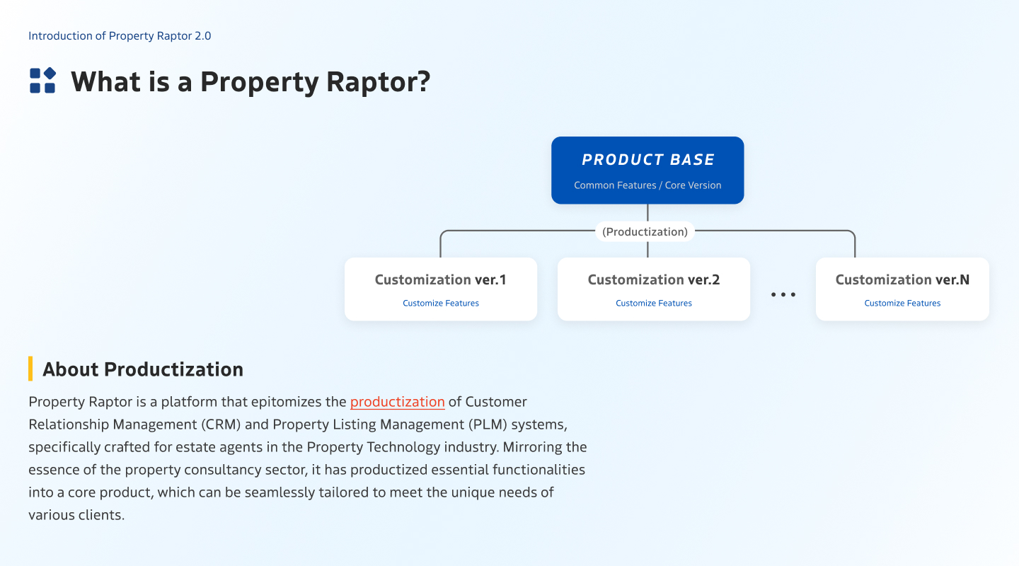
Since each real estate company has its own unique set of workflows, it is difficult for us to use the same set of designs to meet the needs of all clients. We ultimately decided to redesign the product into a variety of different modules, and develop some core modules to easily cope with increased or decreased demand.
1. Focus on Improving UI
Rethink the Business Processes to observe an insights
Research – Real estate industry workflow
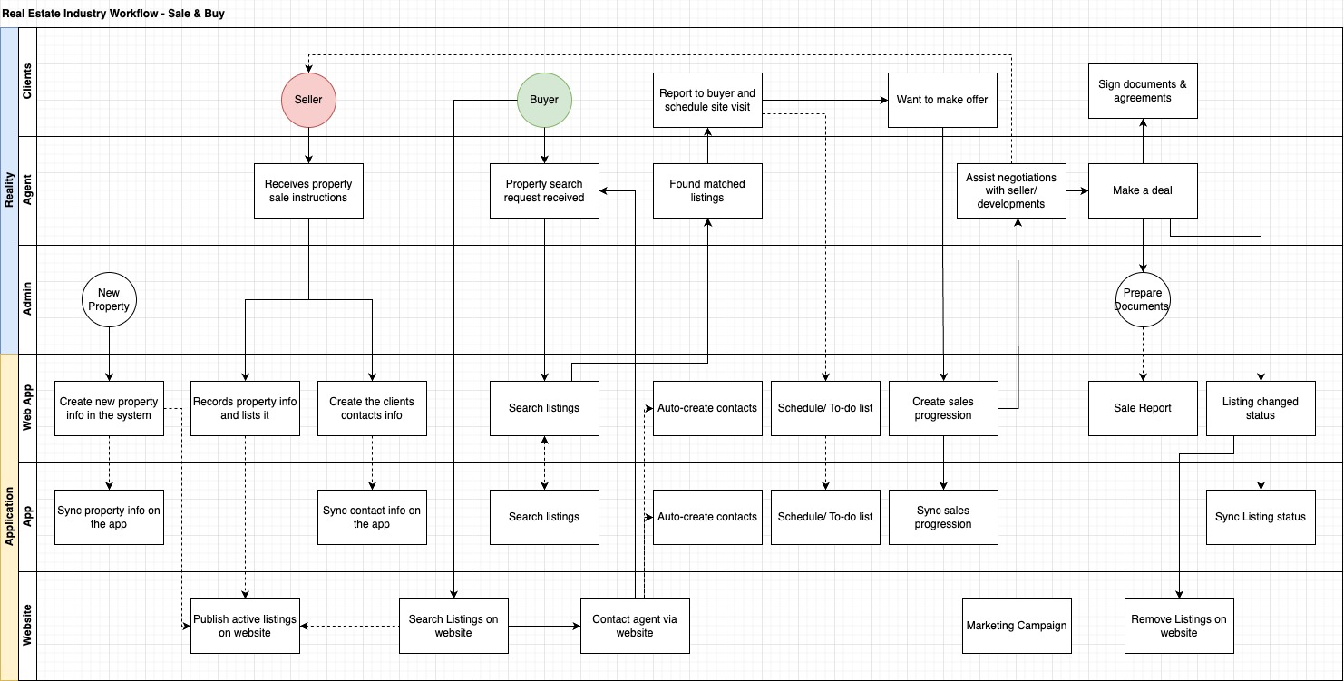
Unlock valuable insights by rethinking your business processes
Business processes can vary significantly from country to country. For example, some local laws require that virtual signatures not be used when submitting certain forms, which may impact the implementation of digital solutions.
Pain Point 1 – Learning Cost
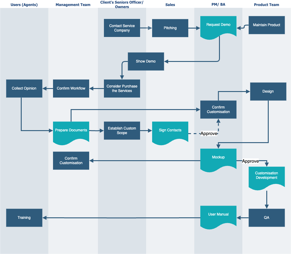
Users ≠ Clients
B2B business process is different from B2C.
In B2B business, users are not equal to clients. Meeting the needs of clients and users can be a challenge.
Users need to pass on the difficulties and needs they encounter during use to our developers through relevant personnel. After the delopment, It needs required a complex training to teach users how to use it. Learning and communication costs will be incurred in the process.
2. Analysis Client’s Feedbacks
Analysing the user feedback to improve the user experience, It can be probably avoid Hawthorne effect happen at the same time.
Pain Point 2 – Multiple Task
User Feedbacks – I need to handle multiple clients issues at the same time
An estate agent who is in the site office is searching through a few property listings to compile a list to present to their clients. Suddenly, a potential lead walks into the office and wants to request some information, leaving their contact details with the agent.
The agent now needs to pause the listings search process and shift their focus to serving this new lead. There is a risk that the agent may forget the details of the previous search results when they had to leave that process.
Design Direction
In this case, the agent needs a method/feature to temporarily hold work tasks for it.

Pain Point 3 – A Small Screen
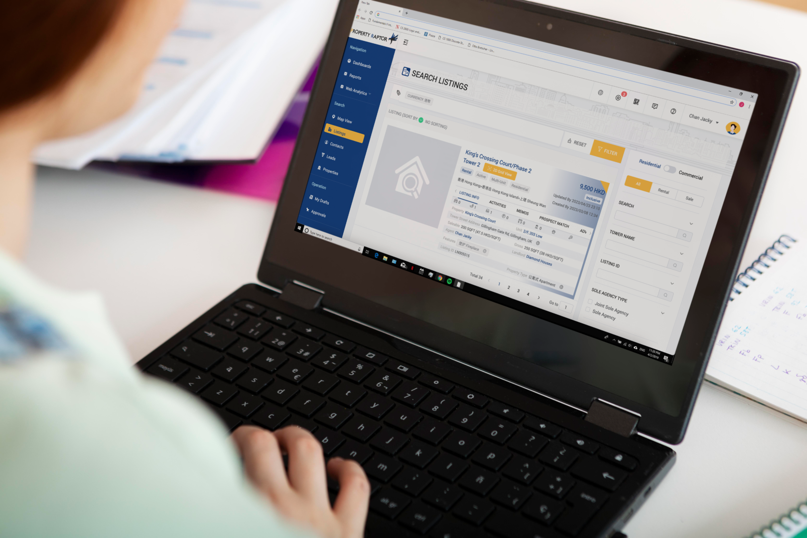

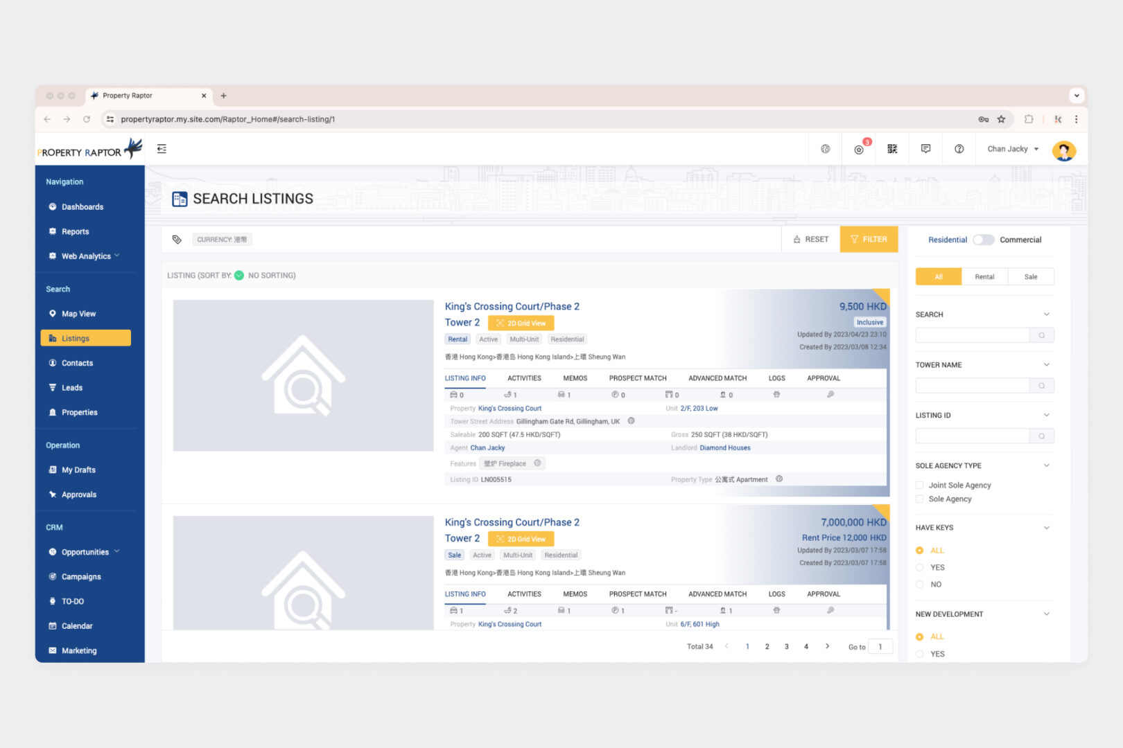
User Feedback – My laptop screen is very small, only 13-16 inches
Agents often use 13-16-inch ThinkPad or laptops for work. The existing web application can only display 1 list card on a 13-inch screen, requiring several mouse scrolls to view multiple list cards. And the navigation bar a bit big on the screen.
Design Direction
In this case, the interface should be flexible use of space. It should be show 3-5 listing cards on a screen, It is because the psychological law – Hick’s law (If something has too many and too complex options, users will spend more time understanding them one by one before making a decision).
3. Modular Design
Improve based on the user’s pain point
When addressing pain points, I consider the software and web pages we use daily. Due to Familiarity Bias, people tend to prefer familiar experiences.
“When resources are limited, leverage the strength of industry leaders.”
By designing the interface similar to these websites, I can lower the user’s learning curve and enhance their experience. I used Google Chrome as a reference for the new interface interactions.
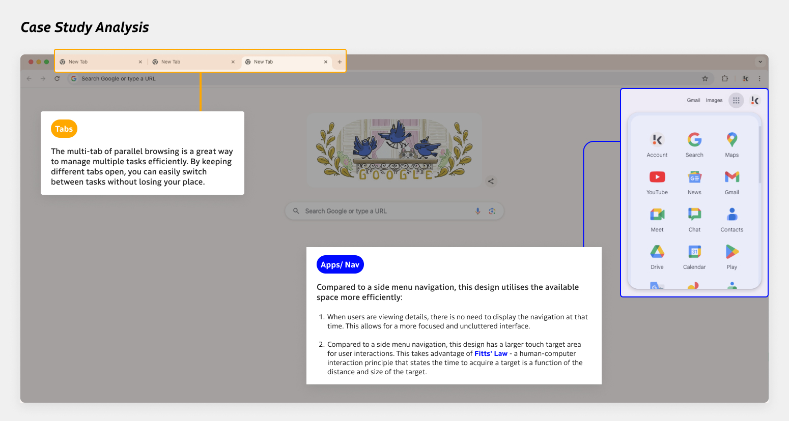
After analysing Google Chrome, I implemented these design elements in the new interface:

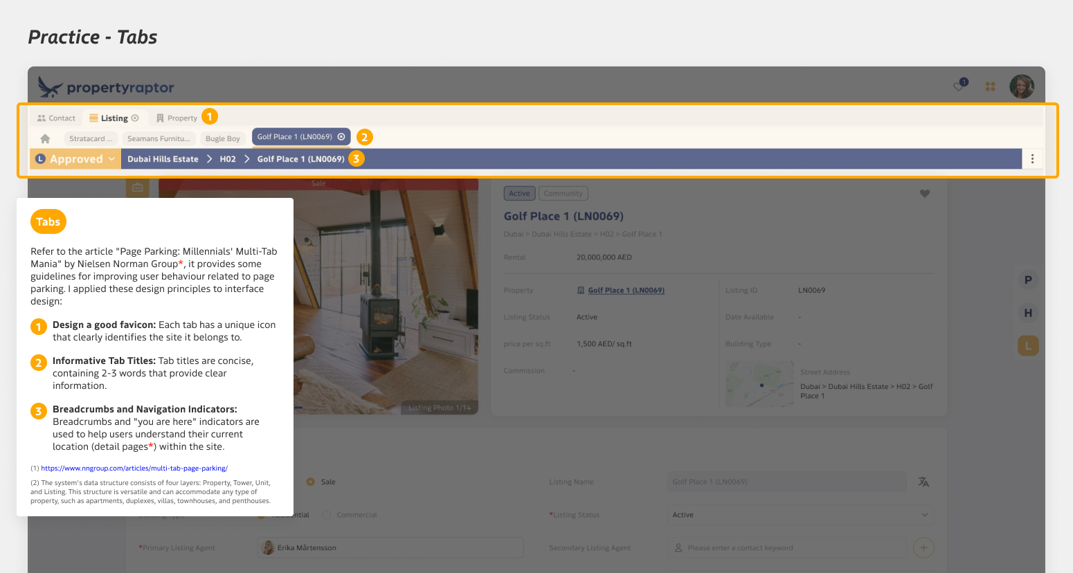
At the end,
This is part of the sharing of ideas for new interface design. This is a long-term product, and I am still maintaining and improving the interface design of the web application and app to make it a product with a better user experience.
I also participated in the interface design of new functions, including: Workflows, EDM Builder, Summary – Custom Widgets, Inquiries (WhatsApp’s Integration), Commercial Tower Structure etc…
The improved design is more concise and intuitive, and it can be flexibly used on any inch laptops.
